-
Phalgunn Maharishi
14:10 02nd Sep, 2015
Google Unveils Its New Logo | TechTree.com
Google Unveils Its New Logo
This is the sixth time Google has changed its logo since the company was formed in 1998.

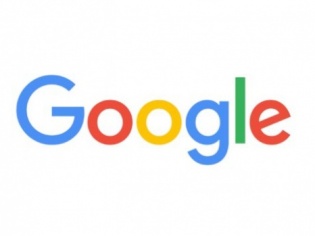
Just as Google became a part of a new holding parent company called Alphabet, the company has unveiled its revised logo.
While the new logo features the same mix of blue, red, yellow and green that Google has been using until now, the typeface is a new one, "Product Sans".
It is worth noting that the new typeface has replaced the "serif" typeface that Google has been using in its logo for more than 16 years.
[Also Read: Five Reasons Why Sundar Pichai Was Made The CEO Of Google]
To recall, this is the sixth time that Google has changed its logo since the company was formed by Larry Page and Sergey Brin.
Speaking about the need for a new logo, Google has announced in its recent blogpost that its new logo is meant to reflect the fact that Google is working for its users even on the tiniest screens and not just PCs.
The new Google logo also comes with a few new elements like a colorful Google mic help you identify and interact with Google whether you are talking, tapping or typing.
[Also Read: Google Does Hindi Voice Search]
Along with this, the new logo has bid a bye to the little blue "g" icon and replaced it with a four-color "G" that matched the logo.
TAGS: Google New Logo
- DRIFE Begins Operations in Namma Bengaluru
- Sevenaire launches ‘NEPTUNE’ – 24W Portable Speaker with RGB LED Lights
- Inbase launches ‘Urban Q1 Pro’ TWS Earbuds with Smart Touch control in India
- Airtel announces Rs 6000 cashback on purchase of smartphones from leading brands
- 78% of Indians are saving to spend during the festive season and 72% will splurge on gadgets & electronics
- 5 Tips For Buying A TV This Festive Season
- Facebook launches its largest creator education program in India
- 5 educational tech toys for young and aspiring engineers
- Mid-range smartphones emerge as customer favourites this festive season, reveals Amazon survey
- COLORFUL Launches Onebot M24A1 AIO PC for Professionals


TECHTREE