


-

Nikhil Rastogi
15:53 20th Sep, 2013
What's In Store With Google and Bing's Redesign | TechTree.com
What's In Store With Google and Bing's Redesign
New UI, new logo — does it mean a new way of looking at search?
Flat seems to be the new look this year. With Google and Microsoft Bing redesigning their logo and UI to make it flat; what does it mean?
What's in store for us?
Well, both companies claim that the New logos represents simplification and more focus on its search offerings and also seamlessness when moving from one product to another.


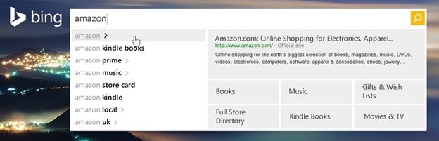
Bing
- Easier navigation: New responsive design for PCs, tablets, and phones.
- Faster search: Search results before the page loads.
- Socially active: Social networking is now fully integrated into Bing.
- A world new world: Microsoft is aggressively trying to push Bing as a new platform and not just a search engine.
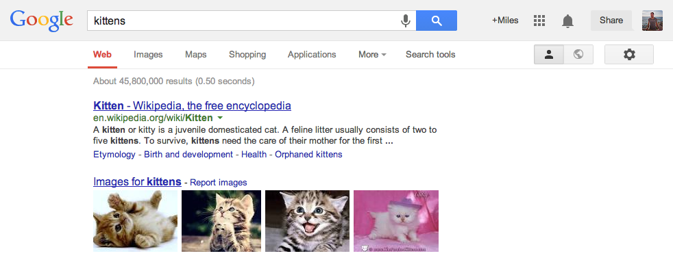
Google
Google on the other hand doesn't appear to have such ambitions at least on the surface. Google is keeping it close to their core strength.
- Clean face: Distractions have been removed with clean interface.
- New Launcher: Google products are now accessible under a new app launcher.
- Streamlined: The updated Google bar streamlines your experience across products and Android devices and chromebooks.
Well whatever be the aim, it certainly means a change in the way we use and interact with online services. Love it or hate it, let us know right below in the comments.
News Corner
- DRIFE Begins Operations in Namma Bengaluru
- Sevenaire launches ‘NEPTUNE’ – 24W Portable Speaker with RGB LED Lights
- Inbase launches ‘Urban Q1 Pro’ TWS Earbuds with Smart Touch control in India
- Airtel announces Rs 6000 cashback on purchase of smartphones from leading brands
- 78% of Indians are saving to spend during the festive season and 72% will splurge on gadgets & electronics
- 5 Tips For Buying A TV This Festive Season
- Facebook launches its largest creator education program in India
- 5 educational tech toys for young and aspiring engineers
- Mid-range smartphones emerge as customer favourites this festive season, reveals Amazon survey
- COLORFUL Launches Onebot M24A1 AIO PC for Professionals
TECHTREE