


-

Sheldon Pinto
14:09 10th Oct, 2014
Google’s Play Store Gets Another Material Design Update With v5.0.31 | TechTree.com
Google’s Play Store Gets Another Material Design Update With v5.0.31
Some changes have been made internally as well.

After a number of updates delivering minor cosmetic changes over the past few months, Google has finally let out a big one that not only gives the Play Store a lot of Material Design elements, but brings some much needed changes as well.
The v5.0.31 update that is rolling out gradually to Android smartphones all over, brings a lot. Too much to be frank, but we will go through just a few for now.
We have a brand new icon to begin with, it is sober and fits perfectly with Google’s Material Design guidelines. Then there are the tiny elements that make a big difference; like how the three lines for the options gradually transform into the a back arrow when you swipe to open the options tab.

Google finally seems to have heard our annoyances with the “What’s New” Section and has has moved it to the top of the page. The portion is now highlighted and yes, you no longer have to scroll all the way to the bottom of the “Read More” section to find out what is the new update about.
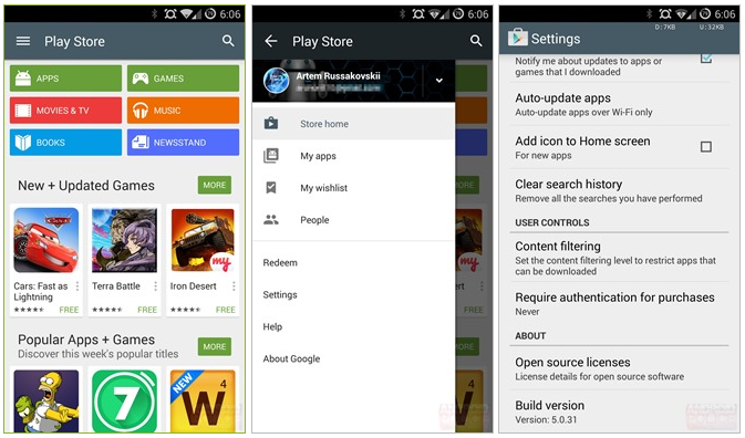
Things now look clean and the iconography has moved to a flat grey, similar to the changes that we saw with the Google+ app yesterday. Moreover we finally get a glimpse of the new icons for all of Google’s apps when you add the Play Store widget to your homescreen.
Lastly even the notifications icons has been updated, indicating that Google is for once taking its design philosophy very seriously.
The Play Store update is getting pushed out from Google’s servers so it may take time till the new UI shows up when you open the Play Store App.
TAGS: Mobile Phones, Software, Google, Play Store
News Corner
- DRIFE Begins Operations in Namma Bengaluru
- Sevenaire launches ‘NEPTUNE’ – 24W Portable Speaker with RGB LED Lights
- Inbase launches ‘Urban Q1 Pro’ TWS Earbuds with Smart Touch control in India
- Airtel announces Rs 6000 cashback on purchase of smartphones from leading brands
- 78% of Indians are saving to spend during the festive season and 72% will splurge on gadgets & electronics
- 5 Tips For Buying A TV This Festive Season
- Facebook launches its largest creator education program in India
- 5 educational tech toys for young and aspiring engineers
- Mid-range smartphones emerge as customer favourites this festive season, reveals Amazon survey
- COLORFUL Launches Onebot M24A1 AIO PC for Professionals
TECHTREE