


-

Alnoor M Peermohamed
16:53 14th Apr, 2014
Rumour Suggests Google Could Simplify The Design Of Icons On Android | TechTree.com
Rumour Suggests Google Could Simplify The Design Of Icons On Android
Google could be looking to unify its icon designs across the web and Android.

Google has some strict guidelines when it comes to designing app launcher icons for Andorid, but has oddly maintained different iconography for its apps on Android and their corresponding web services. According to Android Police that could soon change with Android icons taking a step towards their web counterparts.
The rumour suggests that Google will change the style of its Android icons to closely resemble those of its web properties. The style which is supposedly named "Moonshine" at Google, will see Android icons taking on a more flatter appearance along with shadows appearing behind prominent elements.
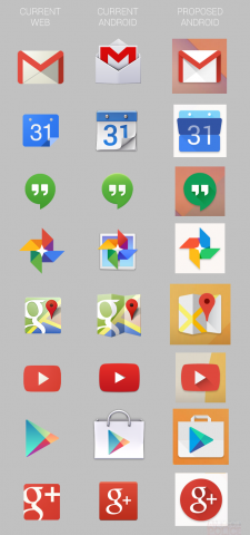
The design of the new icons takes them closer to their web counterparts, but do have a more sophisticated look to them. Andorid Police even suggests the the company could use the new icons across the web and Android to unify its design language.
According to Google's design guidelines for Android icons, they shuld have a unique silhouette, a slight downward perspective, and clearly visible no matter what wallpaper is behind it. While the supposed icons don't exactly follow these rules to the mark, they do seem to be an attempt to somewhat unify them with the ones Google uses on the web.
While it is impossible to say whether the changes will be rolled out, the design consistency and simplified look does seem to suggest Google may be considering it. Moreover, unified icons across platforms will wipe out any confusion users might face, and there's a possibility of Google thoroughly updating its design philosophy.
TAGS: Mobile Phones, Android, Internet, Google, app launcher icons, design language
News Corner
- DRIFE Begins Operations in Namma Bengaluru
- Sevenaire launches ‘NEPTUNE’ – 24W Portable Speaker with RGB LED Lights
- Inbase launches ‘Urban Q1 Pro’ TWS Earbuds with Smart Touch control in India
- Airtel announces Rs 6000 cashback on purchase of smartphones from leading brands
- 78% of Indians are saving to spend during the festive season and 72% will splurge on gadgets & electronics
- 5 Tips For Buying A TV This Festive Season
- Facebook launches its largest creator education program in India
- 5 educational tech toys for young and aspiring engineers
- Mid-range smartphones emerge as customer favourites this festive season, reveals Amazon survey
- COLORFUL Launches Onebot M24A1 AIO PC for Professionals
TECHTREE