


-

Jayesh Limaye
12:03 16th Jul, 2013
Google Play Store Website Gets New Look With Easier Navigation | TechTree.com
Google Play Store Website Gets New Look With Easier Navigation
Now appears more like the Android app.
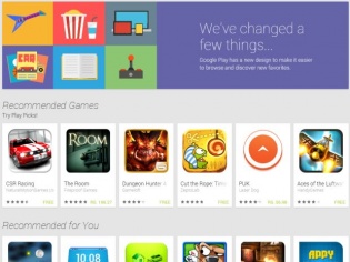
The web interface of the Google Play Store has received a makeover, which makes it look similar to the Play Store app on Android devices. The search giant had announced that such an update was in works at its Google I/O event in May this year. The new interface features a tile-style design, with various recommended items across categories stacked one below the other. There is a navigation pane on the left, from where you can narrow your search and choose to go to Apps, Movies, Books, or Devices. Moreover, the design is reactive — the tiles adjust to the screen size.
After you enter a category from the left, the interface changes, now displaying item tiles pertaining to that category. Jumping to another category is easily possible, by hovering the mouse cursor over the "Category" menu, which drops down categories. Each tile consists of a thumbnail, name, publisher name, user rating, and licence information, in addition to opening the relevant install box. Individual item pages have also been revamped a bit, now featuring bigger images and an overall cleaner look that is easier on the eyes and faster to navigate visually. There is also a Wishlists button that allows you to defer installations.
Unfortunately, there are also a few things that may not go well with users. It is no longer possible to uninstall apps from the web, or at least there is no visible option anywhere to do the same. Also, the interface no longer displays which apps are installed on individual devices associated with a Google ID, rather listing all of them together. Do you like the new web interface of Google Play Store? If you have any new information or nuances to share about it, sound off in the comments section below.

News Corner
- DRIFE Begins Operations in Namma Bengaluru
- Sevenaire launches ‘NEPTUNE’ – 24W Portable Speaker with RGB LED Lights
- Inbase launches ‘Urban Q1 Pro’ TWS Earbuds with Smart Touch control in India
- Airtel announces Rs 6000 cashback on purchase of smartphones from leading brands
- 78% of Indians are saving to spend during the festive season and 72% will splurge on gadgets & electronics
- 5 Tips For Buying A TV This Festive Season
- Facebook launches its largest creator education program in India
- 5 educational tech toys for young and aspiring engineers
- Mid-range smartphones emerge as customer favourites this festive season, reveals Amazon survey
- COLORFUL Launches Onebot M24A1 AIO PC for Professionals
TECHTREE