


-

Phalgunn Maharishi
02nd Sep 2015
Google recently unveiled its new logo which looks to be a fairly prominent change in its recent development.
The new logo, though it still spells the name of the company, it is in many ways the company's biggest redesign in 16 years.
So, what prompted Google to make these changes?
Here are the five reasons.
1. Typeface similar to Alphabet's Logo

We all know that Google got a new parent company last month, Alphabet and the typeface of the Alphabet's logo was newly designed by Google. Similarly, with Google's new logo, the company is opting for a similar style by using a Sans-serif typeface. This was pretty much important for Google to bring in the uniformity to the corporate branding as this visually and theoretically means Google and Alphabet are part of the same family.
2. Light weighted logo

Google is now used across the world on different types of networks from slow 2G connection to fast 4G networks. Apparently, the old logo weighed over 14,000 bytes where as the new one weighs just 305 bytes which means that the new logo can be used on all sorts on networks.
3. Logo for multiple devices

Google is now no longer a site you would visit on a desktop computer. It is a huge collection of sites, apps and services that you visit on PCs, Smartphones, Tablets and even on Smartwatches. Thus, it was very much necessary for Google to come up with this new logo which reflects the reality that Google is working for you even on the smallest screens.
4. Incorporating motion
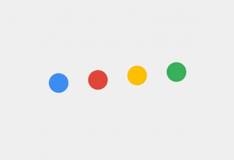
The animation we see with the dots in the new logo is not just for fun. Instead of keeping the logo static, Google wanted its logo to empathise more with the users. With animation being incorporated, Google is trying how it is working for you. The dots are showcasing that an action is being processed like Voice Search. Also, new elements like a colourful Google mic help you identify and interact with Google whether you're talking, tapping or typing.
5. More playful image

With the previous logo looked sleek, flat and sharper, it also had a more business-like, more serious kind of feel. The logo in-fact clearly emphasised that it belonged to a big multi-billion corporation. But, Google wanted it to be more playful, more softer and cuter with round edges. The angled "e" of the new logo looks more like Pacman which again emphasises the culture and feel of the company.
Five Reasons Why Google Redesigned Its Logo | TechTree.com
Five Reasons Why Google Redesigned Its Logo
The search-giant's new logo uses the new sans-serif typeface making it similar to Alphabet's logo.
News Corner
- DRIFE Begins Operations in Namma Bengaluru
- Sevenaire launches ‘NEPTUNE’ – 24W Portable Speaker with RGB LED Lights
- Inbase launches ‘Urban Q1 Pro’ TWS Earbuds with Smart Touch control in India
- Airtel announces Rs 6000 cashback on purchase of smartphones from leading brands
- 78% of Indians are saving to spend during the festive season and 72% will splurge on gadgets & electronics
- 5 Tips For Buying A TV This Festive Season
- Facebook launches its largest creator education program in India
- 5 educational tech toys for young and aspiring engineers
- Mid-range smartphones emerge as customer favourites this festive season, reveals Amazon survey
- COLORFUL Launches Onebot M24A1 AIO PC for Professionals
TECHTREE