


-

Team TechTree
09:07 09th Nov, 2019
YouTube Gets a Makeover, More Power to Users | TechTree.com
YouTube Gets a Makeover, More Power to Users
The design makes the page cleaner by removing information density, instead giving users more flexibility and control on the desktop and tablet versions
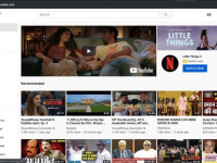
YouTube has rolled out a redesigned homepage that focuses on giving more breathing space for its content that provides users with more freedom to find what they are looking for. The new design shows fewer videos per row, but with longer titles and thumbnails making it easier to figure out what the video is about, thus reinforcing the “content is king” philosophy that Google has taken on board.
“The updated design will begin rolling out today across desktops and YouTube apps on Android and Apple tables, and will be available to everyone soon,” the company says in its official blog. An important update is the removal of that irritating feature that suggests what video to watch next, though users would have to manually fix the settings in order for this functionality to stay silent.
“We launched a feature on mobile earlier this year to make it even simpler for you to tell us to stop suggesting videos from a particular channel and today we’re bringing this to desktop. Just select the three-dot menu next to a video on the home page, then select “Don’t recommend channel.” After that, you should no longer see videos from that channel suggested to you on the homepage,” says the official blog while adding that these videos can be accessed via search or via the Trending tab.
Earlier this year, Google had redesigned its news section in search by spreading out articles into cards instead of compressing them into groups of headlines which meant that while less content was showcased on a page before the user scrolled down. This resulted in more white space and much longer previews of the news story, giving users the option of not having to click and find.
In the remodelled YouTube home page, Google has used the very same principle with fewer videos per row besides more high-resolution previews and the option of easily creating a queue of what one wants to watch down the line. In addition, the company also announced that it was removing some of the content shelves where it organizes videos by topics and channels.
While the same videos may show up based on user behaviour, the new homepage places them in shelves such as Top News and Breaking News that makes currency of content a critical factor for the user. Given that news is one of the top preferences of users in India, this feature should be a boon for those of us who want to keep abreast of the latest goings on around the country.
Given the success of YouTube’s playlist creation, the company has brought in the “Add to queue” feature to the desktop where the user just has to click a button on the video thumbnail to add it to the Watch later list. However, YouTube warns users that it would clear the queue once the user closes the browser as the company wants to retain the difference between a queue and a Watchlist.
Another feature that is moving from the mobile to the desktop is the ability to customize the home feed and related videos by selecting favourite topics. The blog post says that YouTube is currently experimenting with this updated design and based on user inputs has made several enhancements that makes it easier for users to navigate the “incredible breadth of content available on YouTube.”
By the looks of it, Google seems to be keeping its recommendation engine at bay even on YouTube while allowing users the option of choosing what they want to see and follow. With the ad-free option available at a cost, it seems the company is truly turning secular.
News Corner
- DRIFE Begins Operations in Namma Bengaluru
- Sevenaire launches ‘NEPTUNE’ – 24W Portable Speaker with RGB LED Lights
- Inbase launches ‘Urban Q1 Pro’ TWS Earbuds with Smart Touch control in India
- Airtel announces Rs 6000 cashback on purchase of smartphones from leading brands
- 78% of Indians are saving to spend during the festive season and 72% will splurge on gadgets & electronics
- 5 Tips For Buying A TV This Festive Season
- Facebook launches its largest creator education program in India
- 5 educational tech toys for young and aspiring engineers
- Mid-range smartphones emerge as customer favourites this festive season, reveals Amazon survey
- COLORFUL Launches Onebot M24A1 AIO PC for Professionals
TECHTREE