


-

Team TechTree
11:51 23rd Jul, 2014
The Google Play Store For Android Gets A Lick Of Material Design | TechTree.com
The Google Play Store For Android Gets A Lick Of Material Design
In the run up to the launch of Android L, Google is keeping us busy gawking at how beautiful its new designs really are.
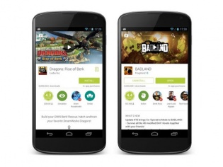
Google has begun rolling out a major visual update for its Play Store app on Android, hinging heavily on the company's new Material Design philosophy. The update comes in the run up to the launch of Google's all-new mobile operating system, Android L, and is an update to provide a more consistent experience to users.
On the face of it, the Play Store update seems pretty minor, but enter a product page and the extent of the re-design becomes apparent. Cover art and photos play a big role in shaping up the new Play Store, and everything is in keeping with the layered philosophy of Material Design.
Ratings, overviews and genres are now depicted by easy to read icons, but the one thing that is carried over from the previous design is how scroll-intensive it is. Overall, the Play Store is now visually prettier and is much easier to understand at a glance.
[Also read: Google's Play Store Is Getting A Massive Makeover]
Google's Play Store for Android has always been a very functional piece of software, and as expected the company hasn't been able to cram in any new features (or didn't want to). The update will roll out in a phased manner across Android devices, but if you can't wait so long, head over to Droid Life for the download link.
TAGS: Google, Play Store, Android L, Material Design
News Corner
- DRIFE Begins Operations in Namma Bengaluru
- Sevenaire launches ‘NEPTUNE’ – 24W Portable Speaker with RGB LED Lights
- Inbase launches ‘Urban Q1 Pro’ TWS Earbuds with Smart Touch control in India
- Airtel announces Rs 6000 cashback on purchase of smartphones from leading brands
- 78% of Indians are saving to spend during the festive season and 72% will splurge on gadgets & electronics
- 5 Tips For Buying A TV This Festive Season
- Facebook launches its largest creator education program in India
- 5 educational tech toys for young and aspiring engineers
- Mid-range smartphones emerge as customer favourites this festive season, reveals Amazon survey
- COLORFUL Launches Onebot M24A1 AIO PC for Professionals
TECHTREE