


-

Chandrakant 'CK' Isi
10:15 20th Sep, 2013
Google Goes Flat With Its New Logo | TechTree.com
Google Goes Flat With Its New Logo
The search giant also plans to redesign the navigation bar.
Just a day after Microsoft redesigned the logo of its search engine Bing (that nobody cares about), it's now Google who has gone with a new look. The new logo is completely flat, but no, it hasn't been design by Sir Jonathan Ive.
Last time the logo was revamped was in the year 2010. Apart from the logo changes, Google also plans to replace its navigation bar with an Android-esque grid of icons. According to the Big G, this has been done in a an attempt to streamline the user experience across various platforms such as phones, tables, and PCs. The company plans to roll out this update over the next few weeks.
Below are images that show how Google's logo evolved over the years. (Images sourced from Archive.org)
Original Logo: Quite awful.
Year 1998: Awful with exclamation mark.
Year 1999: Comparatively easy on eyes.
Year 2000: No more drop-shadow effect.
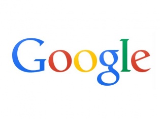
The spanking new logo.
News Corner
- DRIFE Begins Operations in Namma Bengaluru
- Sevenaire launches ‘NEPTUNE’ – 24W Portable Speaker with RGB LED Lights
- Inbase launches ‘Urban Q1 Pro’ TWS Earbuds with Smart Touch control in India
- Airtel announces Rs 6000 cashback on purchase of smartphones from leading brands
- 78% of Indians are saving to spend during the festive season and 72% will splurge on gadgets & electronics
- 5 Tips For Buying A TV This Festive Season
- Facebook launches its largest creator education program in India
- 5 educational tech toys for young and aspiring engineers
- Mid-range smartphones emerge as customer favourites this festive season, reveals Amazon survey
- COLORFUL Launches Onebot M24A1 AIO PC for Professionals
TECHTREE